The Taco Shack is a mexican street food van that specialises in tacos and nachos. It's based in Devon, UK and serves their delicious food at different food markets and provide catering for various types of events. I was in charge of creating the brand identity, website and menu design.
mock-up of the logo
I've always wanted to create designs for the food industry and I had lots of ideas and directions to go in. On this project I started by researching mexican design, the competition and what makes people remember a food truck in a market. The first thing that came to mind was to create a distinctive design element that can be used alongside the logo or by itself - a symbol of sorts, an icon. Since the business is based on tacos, I thought it was only right to make a little taco icon.
Finding the typography was a longer process, filled with trial and error. The most important aspect of choosing fonts was to encapsulate the mexican focus of the business, but also bring them into a street food market context in the UK.
The same can be said about the colour scheme. Although the usual depiction of mexican colours may be green, orange, red, yellow, I wanted to use something that wasn't going on that classic, overused direction, but use the colours that are less associated with this type of food, but have roots in mexican design and are also modern and appealing to the eye.
the brand identity and design elements of The Taco Shack
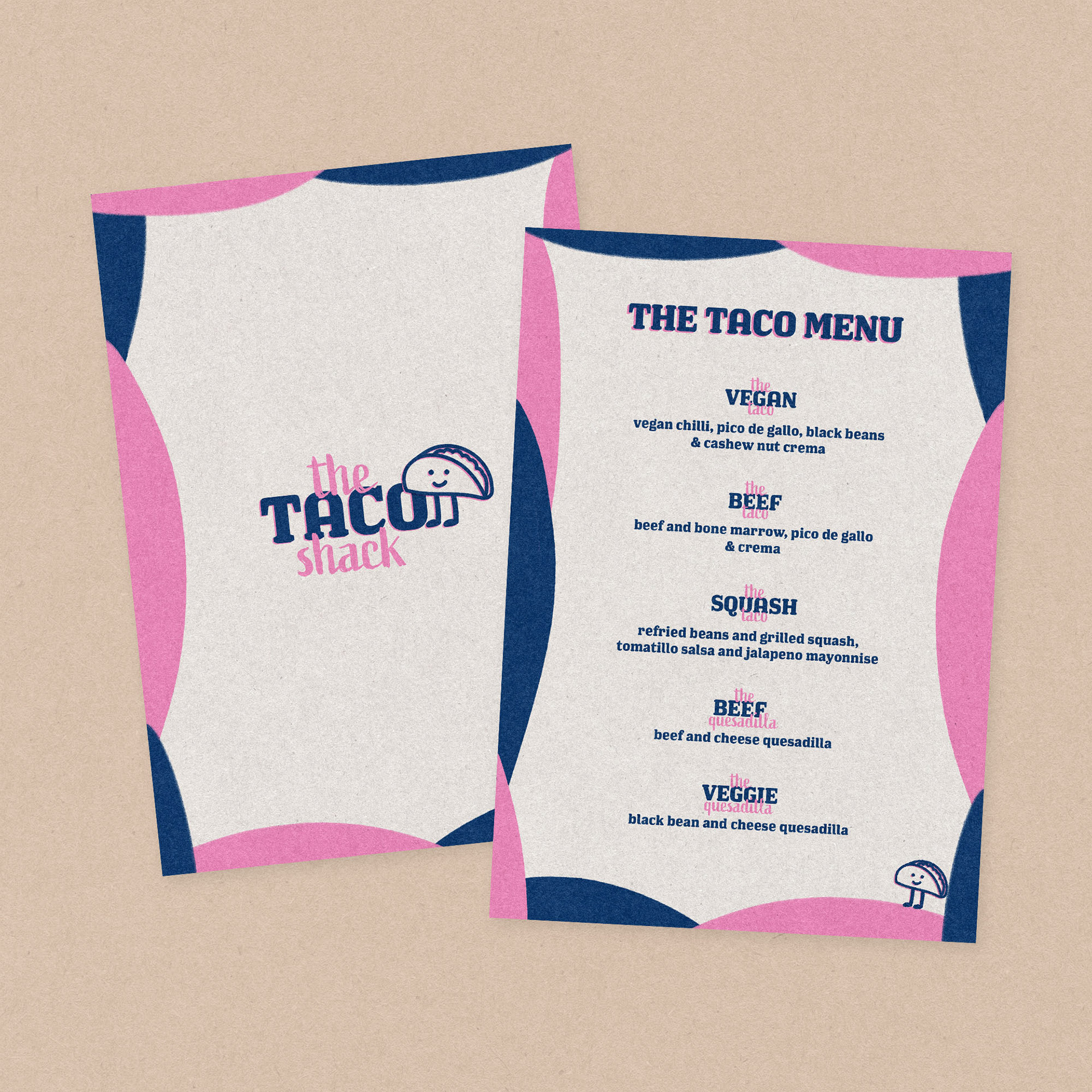
the front and back side of the menu
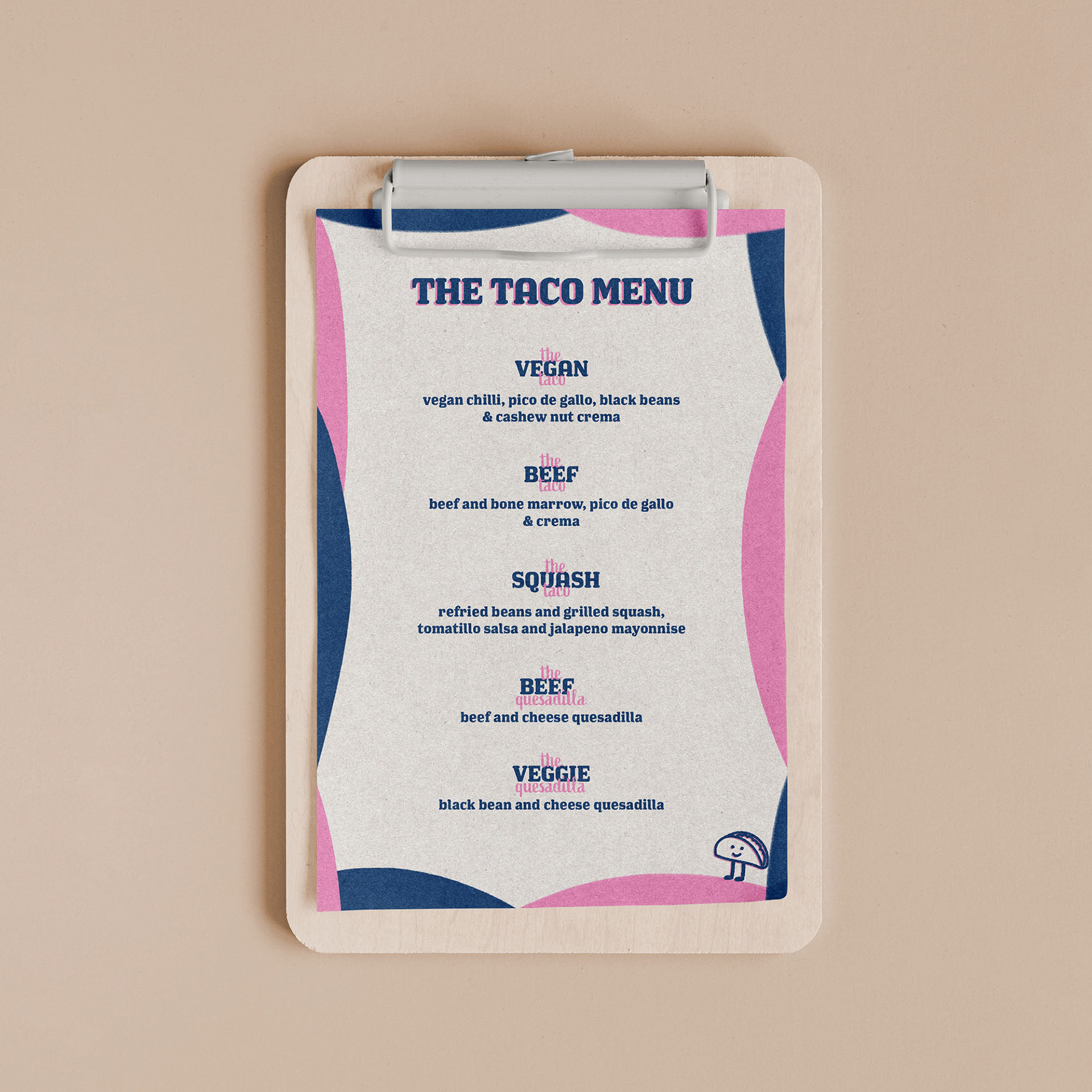
mock-up of the menu
When it came to design the menu, everything came quite naturally due to the distinctive colour scheme and font choice. The real challenge of this design was to make it as simple as possible, yet eye-catching enough for the people in a street food market to be interested in viewing. After playing around with different textures and brush strokes, I decided on using large round charcoal strokes along the side of the menu.
the website design overview for The Taco Shack
The website for The Taco Shack is a pretty straightforward one. It contains a homepage, an about page, a menu page and a contact one. It plays around with the brand identity, using the design elements such as the little taco icon and the charcoal brush strokes throughout the entire website. The website was creating in Wix and all the graphics and mock-ups have been created in the Adobe Suite.
